Harris Green Village - The Problems and Opportunity of a Massive New Project
Cover image from the Starlight Developments site here.
Another massive project in Harris Green has been proposed and the city is rife with knee-jerk condemnations of it. The familiar ranting about not wanting to become Vancouver and cookie cutter architecture can be heard almost anywhere this project is being discussed. On one side, given the size of the project, some basic level of immediate concern is warranted, but it shouldn’t become the only perspective on the project. I am of course discussing the Harris Green Village project from Starlight Developments. This is the giant proposal to replace the current Harris Green Village suburban strip mall in the 900 block of Yates Street and also the Dodge/Jeep dealership in the 1000 block of Yates Street.
Much of the backlash to date against this project has been simplistic, focused mostly on the height of buildings and the sheer scale that is being proposed. Too much focus on just those aspects doesn’t allow for a discussion to begin on how the project can be improved so that it can proceed, mostly because the perspective is that it shouldn’t proceed at all.
That position ignores some fundamental facts about Victoria right now. First, people are moving here in significant numbers; second, home prices are already high; and finally given the current state of the pandemic, downtown needs some long term help should workers not return in the same numbers as before the pandemic. As I recently said on Twitter, we face a a choice of significantly increasing the supply of homes in and around downtown; cutting down vast amounts of forest to build houses in the surrounding communities or allowing house prices to continue to skyrocket. There isn’t anyway to stop people from moving here and it is clear that they are not going to. For me the solution is that we need to increase the supply of homes dramatically in the downtown core and surrounding areas. While this increase in multi-family projects means our city will change, this change can be for the better. More residents in a small area leads to increased vibrancy and diversity while also helping the downtown economy. This does not mean that we should give developers a blank cheque to build whatever they want to, but we should be focused on working with developers to say we need large buildings with lots of livable units. Those units need to be well designed for those that will live there, while also focused on the public realm interaction. In this article I will talk about a couple of the main concerns that are being raised about this project and building in Victoria generally. I will also revisit some of the basic terms that we see used in development discussions and finally talk about some of my concerns with this development in particular, which are actually relatively easy (though with some attached cost) to fix.
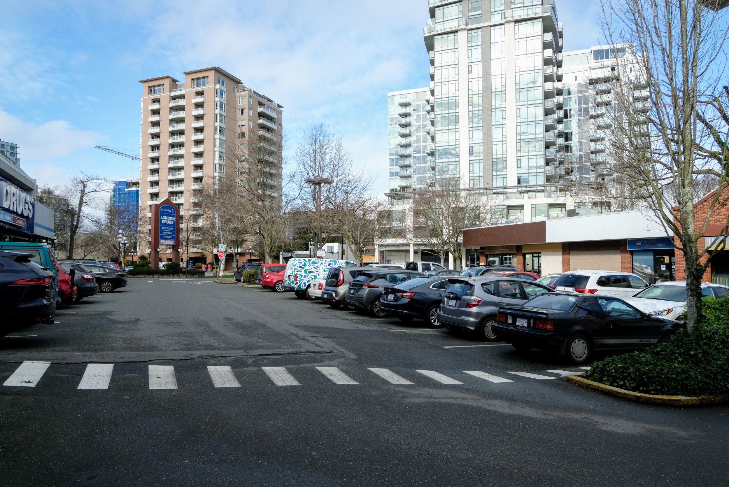
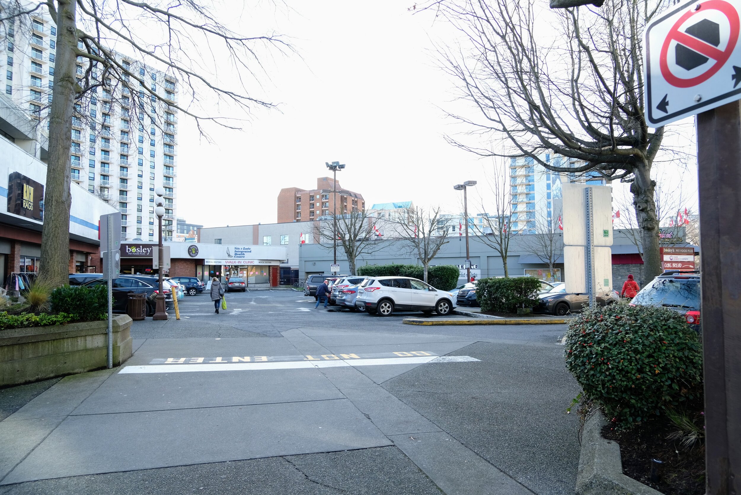
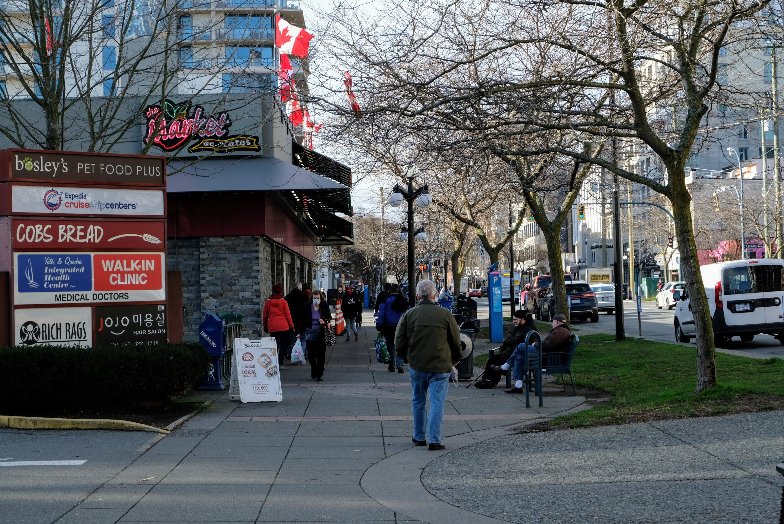
To get some context on the project as a whole I would strongly encourage you to do some digging through the City of Victoria Development Tracker site for the project available here. You will find all sorts of documents from the developer there that lay out what they are trying to do here. I have also linked their project page above which has much of the same information. Below are some photos of the space we could be losing to this project…

Density
This project has an overall density of 6:1 FSR (Floor Space Ratio) which is fairly high for new developments in Victoria, but in line with the new Official Community Plan for the area. I have a long description on how density measurement works here. Basically though, for the two parcels of this project what a 6:1 FSR means is that the buildings are equal to building a six storey building across all of the entirety of the lots. You can’t build buildings that way though because it would leave large portions of the buildings unlivable due to the distance from any window. The project is instead suggesting building three distinct podium structures with five towers rising from those podiums the eastern lot has two towers while the western larger lot has three. The towers are all fairly tall for Victoria with 19 and 21 storey towers at the east and 27, 28 and 32 storey towers at the west. The 32 storey tower would become the tallest building in Victoria. Remember though that the space in the buildings is equal to just building 6 storey buildings.
So here we have a choice, build up the buildings at this height or reduce the height but increase their site coverage. I am assuming that we don’t try and reduce the density because as I have already said we need the living space downtown. Now I can already hear the claims that we should instead be looking to places like Paris as an example of where we need to go. That they have high density buildings at much lower levels, first I will say that the buildings in Paris are high density, though this comes at a cost, one is shadows which we will talk about later and the second is that a lot of the units are less than ideal for actually living in, also Paris should not necessarily be a model for any city that is trying to reduce the cost of rent or buying a unit. Shorter high density buildings as I said can have some pretty negative aspects, we have a good example here in Victoria where the developer certainly has tried to make lemonade with lemons with the Hudson building. It looks beautiful as you walk around it but what is often forgotten by everyone except those that live here is, that there are a large amount of units that actually face an inner courtyard which had to be cut out of the middle of the building because as I said having a building with a full site coverage can make parts of the building unlivable otherwise.
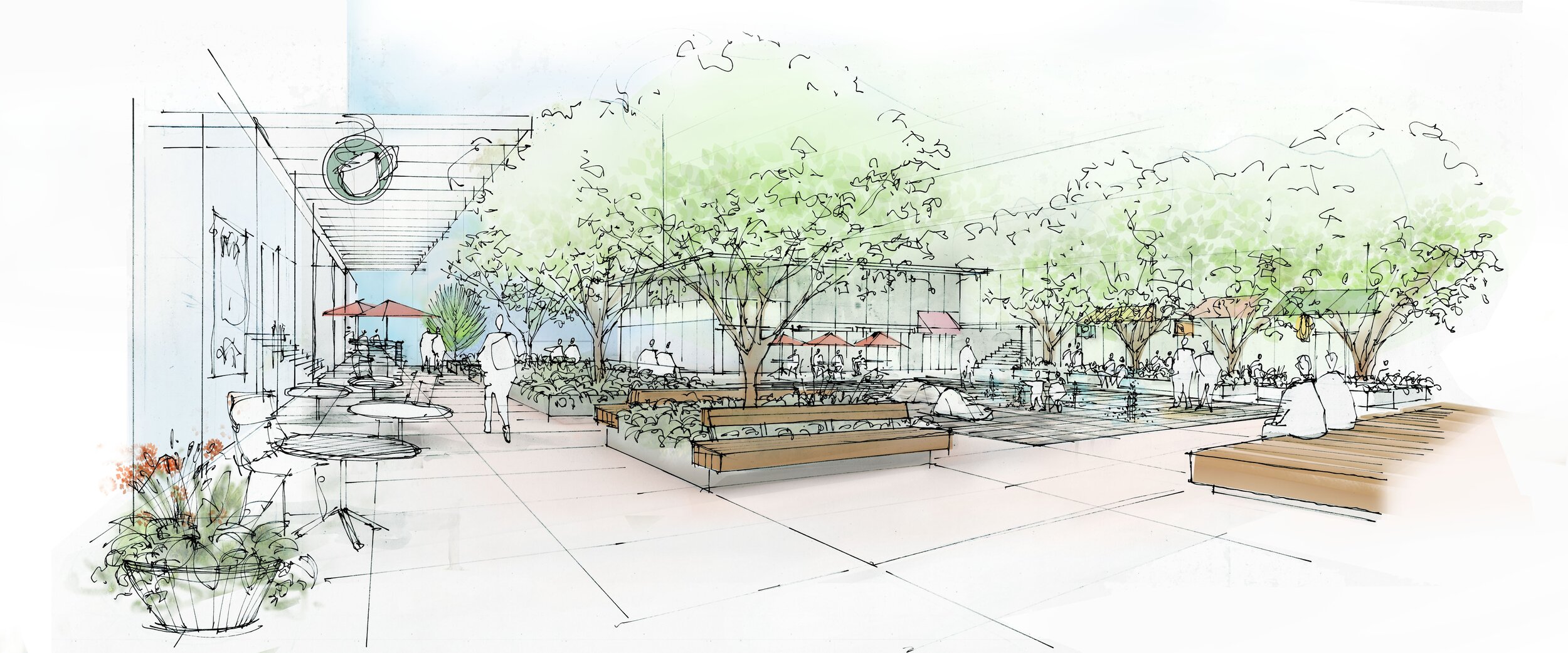
In trade for the height at Harris Green Village, the project includes a massive public space that runs through the 900 block. This space simply would not be available without maintaining the building heights and I think that is a very fair trade off considering the abomination of public space that currently exists there. I have done a video that on the current site
Shadows
I know some of you are saying that the new towers will bathe the city in darkness. While the towers will certainly have long shadows, their appearance at street level will be no different than if the buildings were four storeys and given the open space between them if the density were maintained but the whole project brought down to say 10 or 12 storeys the shadows would be much more ominous and overbearing. Here is a link to the current shadow studies. As you will see this proposal will allow a massive amount of sun onto Yates Street all year round, something that simply won’t happen if the building height was lowered with the density maintained. Again I think that it means that the heights are appropriate. If you want to see the current impact of low buildings, just walk along Johnson Street at lunch time right now and you will see that a three storey building can cover a street in darkness.
Large Projects
That doesn’t mean that everything is okay with this project. One of the significant benefits that has come of the previously slow development process in Victoria is that lots get developed slowly over time and through the changing fads in architecture and design. This has led to varied streetscapes and very few buildings that look alike. Of course there are a few twin buildings but they are the rarity.
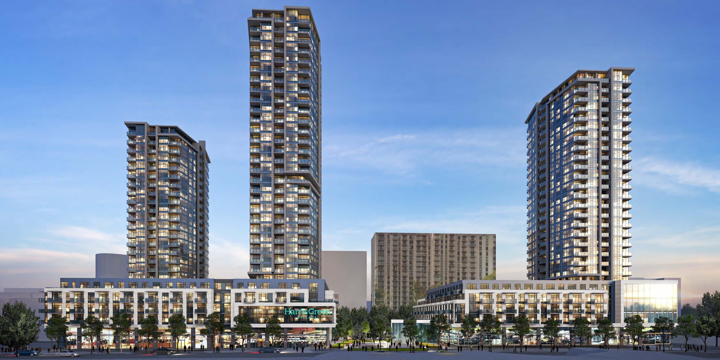
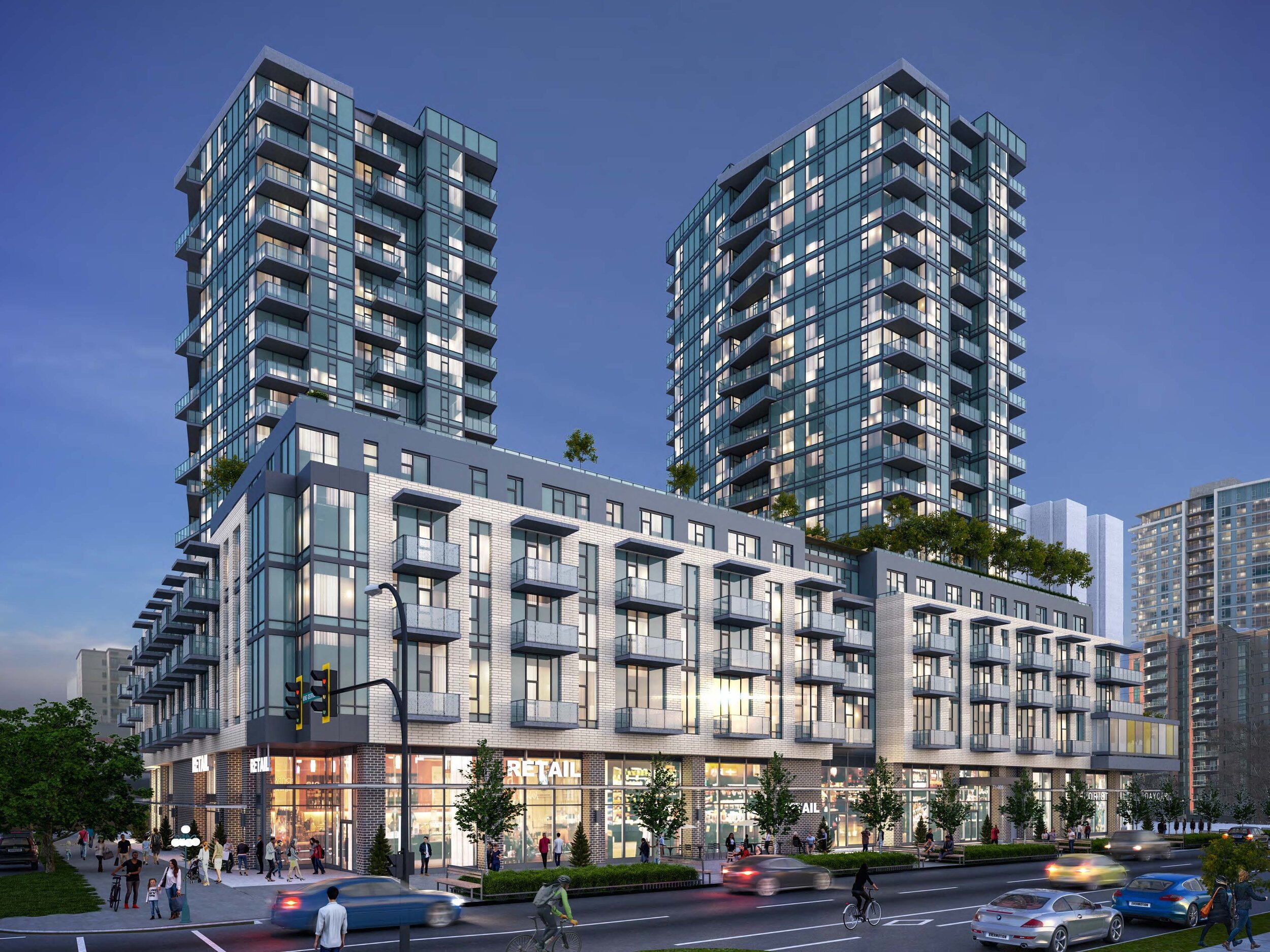
When large amounts of land get developed at the same time by one developer who has hired one architecture firm there is a chance that the buildings will have significant common themes across them. On the surface this will be sent up as a feature by the developer, but it is a significant negative. One only needs to look at the Bayview project in Vic West to see the downside of shared colour and façade treatments. This problem is not uniform though and you can just as easily look to the Hudson project by Townline to see variation of design with a theme more subtly expressed.
The drawings for the Harris Green Village project have me concerned that we are seeing a little more Bayview and less Hudson in the project. If we assume that this is just a massing design then I think that this is okay. If it is closer to the final outcome, it will be a huge mistake and a completely avoidable one that won’t even require the developer to sacrifice any of the space. Giant projects can overwhelm an area and even in Harris Green it is hard for anyone to look past the suburban nature of the Regents Park buildings and how they have dominated the architectural story of the eastern portion of Harris Green for the last few decades. Five buildings of the same shape and nature would be significantly more dominant and more damaging.
Solutions
The need to visually break up the project is easier than you would think. One need only look around the rest of Harris Green to see the variation of buildings that have been built. Applying this principle to a large project like this would be essential. It will cost a bit more that is certain, but for the ability to build dense buildings that will be the tallest in the city it seems fair to the developer. I think that the city should be requiring different architects for at the very least each parcel (though I would prefer it if each tower had a different architect). Beyond that they should ensure that the towers use different cladding and colour schemes to make their difference stand out. The interior product that will be rented can be as similar as they wish so long as it is comfortable enough for their customers.
A second requirement would be to ensure that especially along the ground floor, and maybe the entire podiums aspects of the buildings, they should be varied at least every half block if not more, to give the pedestrian the illusion of passing many separate buildings. This can again be done by varying the cladding or increasing and decreasing the window coverage along the sidewalk.
A final way to ensure at least along some portions of the buildings (Yates St, Quadra St, Cook St. and the central park space in the 900 block portion), is to have small commercial spaces. As I wrote in this article, one of the keys to a successful (post-COVID) shopping area is variation and variety. This not only gives customers more places to shop, but that variation also provides a colour palette to the shopping area through the different wares and services provided. A great example is the Atrium building where you walk along Blanshard and you are focused on all the different spaces and not the fact that the building itself is monolithic.
The bottom line of this project is we need these living spaces. There isn’t an option to make downtown European while keeping our North American suburban areas around it, especially if we want housing costs to go down. We need significant built density and from an environmental perspective we need as many as possible in a small walkable area. That area is and should be downtown Victoria.
I would love to hear your thoughts, especially if you think there are alternatives that I have not considered.
