How (not) to Create a Great Downtown City Corner
City life happens on its corners. Think about the last time you asked someone to meet you on the street, chances are you told them to meet you at the corner of one street and another. No one in Victoria has said, “I will meet you halfway along Pandora between Douglas and Blanshard. Even just last weekend I went to a street photography meet-up with a group of people I had never met. The starting point was the south-east corner of Yates and Douglas. It is at the corners of our city streets where you will find crosswalks and people moving in so many different directions because it is the axis of two ways to go. Because street corners are such important parts of our cities, it is imperative that when we are building at them, that the new edifice takes into account the fact that it sits on the corner.
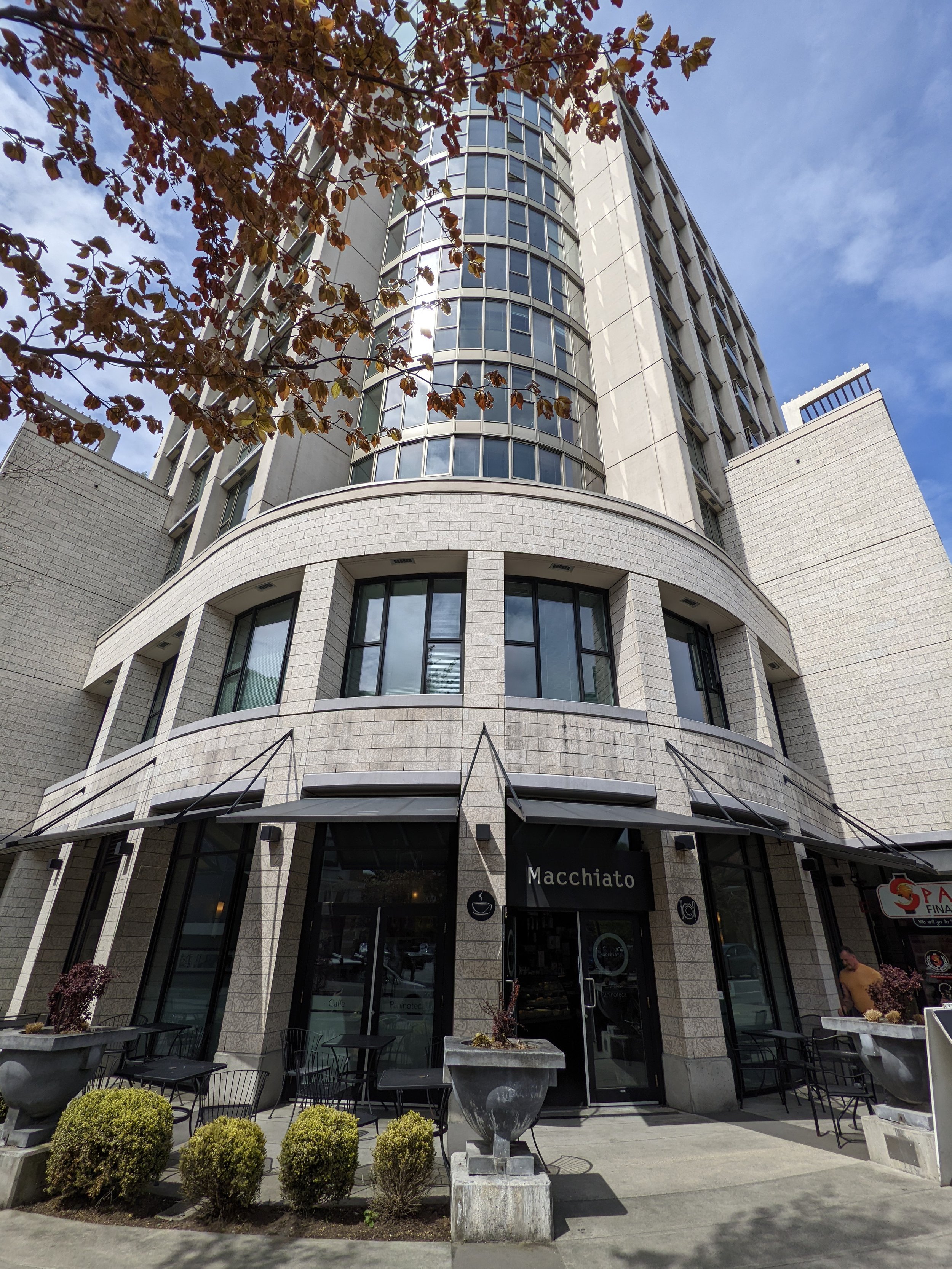
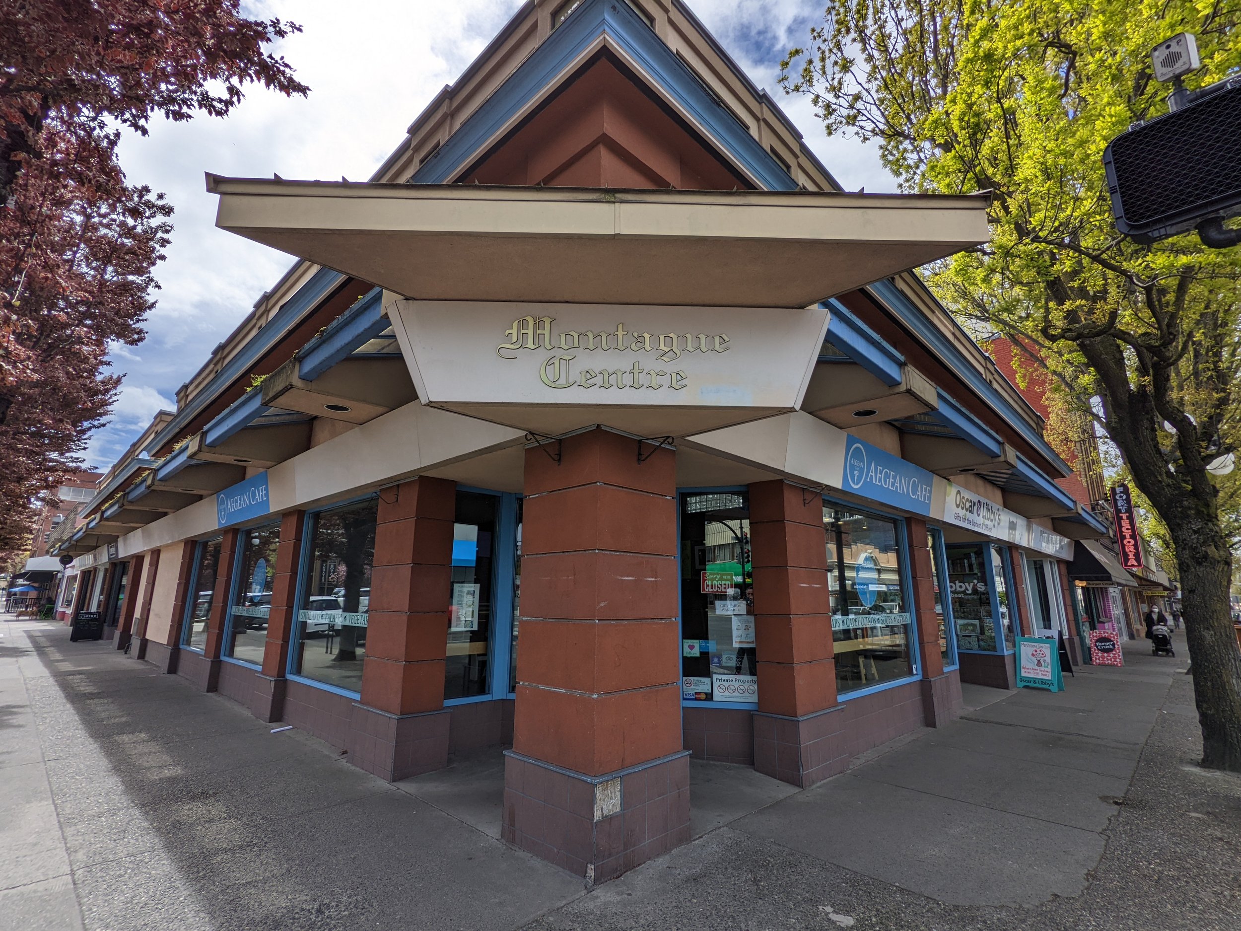
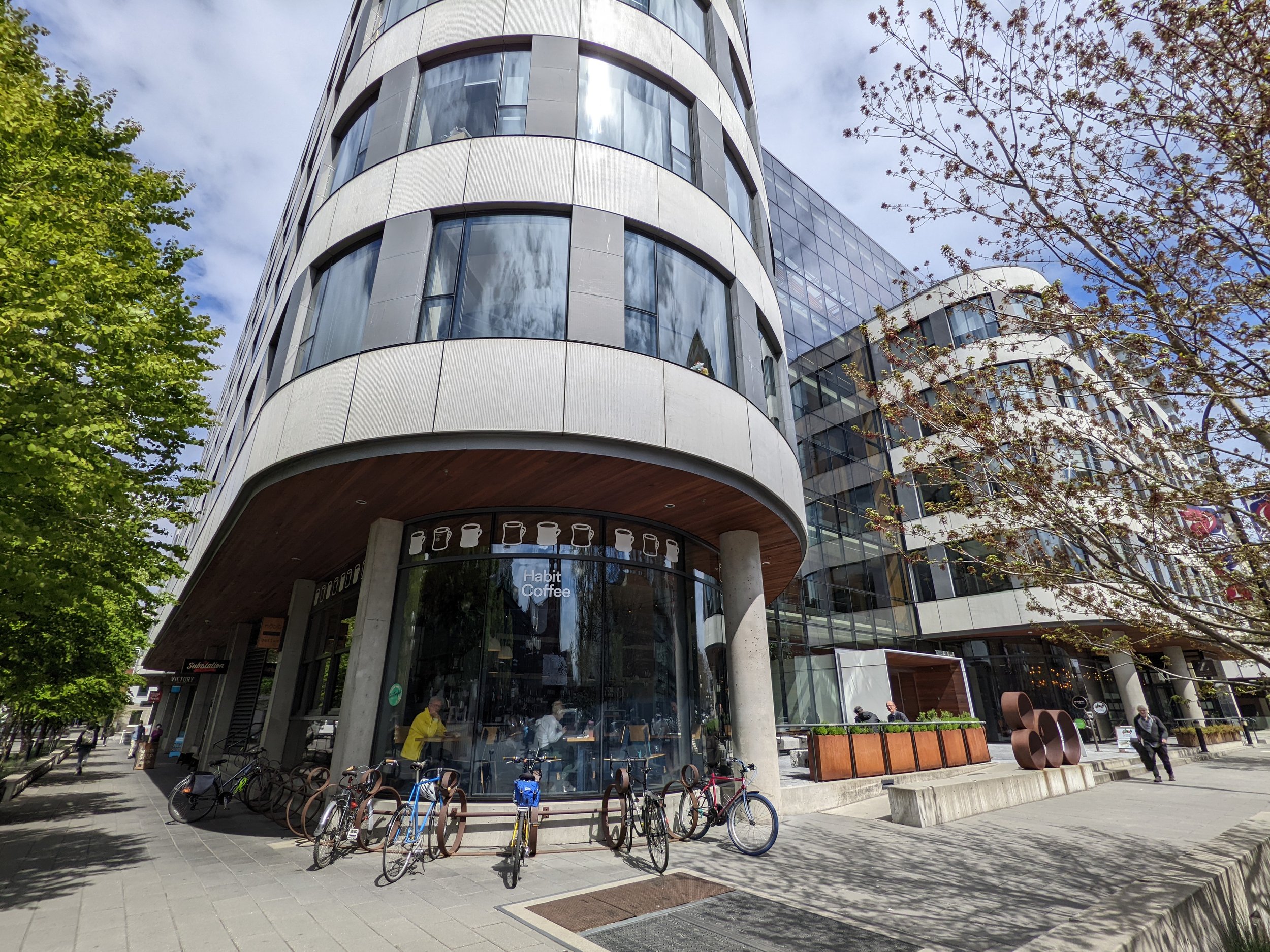
In Victoria, we have amazing examples, both old and new, of how to build on the corner. A couple of my favourites are the Atrium Building, with the Habit coffeeshop so prominent on the corner; the Belmont Building, with its beautiful almost turret-like corner; and the courtyard entrance to the Sussex building at Broughton and Douglas. These three examples are all quite different from each other, but do have one unifying factor, they recognise the importance of the corner.
Of course, Victoria is full of many terrible corners as well. Many of these bad examples are due to having parking on the corner portion of the lot. Other times it is simply bad design, or lack of consideration of the context of the building. It is on the these last two points that I want to focus and look at two new projects both being proposed for northern Downtown (or the NotCh if you have been reading for awhile) along Douglas Street.
Before we get into the specific projects, I need to talk about Douglas Street a bit for context. Douglas Street is most certainly Victoria’s busiest and arguably most important street. Despite its prominence in Victoria, it has more than its share of challenges. Many I think come from sidewalks that are too narrow for a central street and buildings that are too short in comparison to its breadth which I think belies its importance. Douglas Street also had more than its fair share of terrible street / building interactions at its corners. Some of the more prominent are the Royal Bank Plaza at Fort (Could actually be amazing), the terrible, stairs everywhere City Centre Plaza building at Pandora; the “that’s not how you build a portico walkway” atrocity of the Victoria Conference Centre; and the impenetrable 1803 Douglas building at Herald Street. What these buildings and so many others along Douglas fail to take into consideration is the pedestrian and what a pedestrian needs to engage with a building. The key parts are pretty easy: No stairs, big windows and lots of doors. Those things usually also mean that you want things on the inside of your ground floor that a pedestrian might actually want to go inside and look at too. I have written about these ideas before here, here and here if you want to dig a little deeper.
To get into the specific examples, I want to talk about two new proposals for Douglas Street, one at Caledonia and the second three blocks north at Queens. As I said, when it comes to how they are planning to interact at the corner, I think one is missing the context of where it is and the second one is just plain bad.


710 Caledonia
I am sure that as it moves through planning the developer will come up with a more exciting name at some point. The developer is David Chard who has brought us a number of great buildings downtown (Like the Juliet at Johnson and Blanshard which has a great ground floor). This project contains three distinct buildings over top of a common podium portion. You can have a look at it here. There is a lot to like in the proposal. First and foremost, it is mostly replacing a parking lot as well as the Capital City Centre Hotel property with housing. I will somewhat miss our City’s only poolside bar, though it has been closed for a couple years anyways. I also really like that there is good variation between the buildings and that the podium is not a unified design across the whole site. The plans also seem to indicate a new full service grocery store as well as a south facing patio for a restaurant. The restaurant patio overlooks a plaza and this is really why I am using it as an example of where we could put a little more effort into the design process and consider the neighbourhood and if a plaza is warranted.
Compared to the strong corner examples I gave before, this design really is about a complete lack of a distinct building corner and instead there is a designed plaza to draw your eye. I will say that a corner plaza can be a good thing. Plazas are almost like small parks, places of respite in a huge sea of corner to corner buildings. Thinking of this area (the NotCh), I am not thinking an area of non-stop buildings and here in particular there is already a plaza just across the street at the Hudson project along Caledonia. There is also the very large corner plaza at the arena and there is Centennial Square, three block south (just because we have bad public space does not mean we should continue to add more till we get it right. Fix the ones we have!) To have a good plaza we need people to sit and occupy it. I am going to guess that given the options nearby, the choice is not going to be made to sit along Douglas Street. But if we are going to have a plaza here, I also think the design being put forward is challenging. I get we are dealing with a sloped site here and so the design is the way it is due to the want to not have the grocery store partially underground. Still when we look at the plans the main focus seems to be to create a set of stairs and obstacles between Douglas Street and the entrance to the planned grocery store. Looking at examples such as City Centre Plaza and especially 1803 Douglas, just a block away, this seems like a terrible mistake. While the planning idea is that the stairs might be used like seating on a sunny day, given the surrounding area and the fact that Douglas Street is right there, this seems a highly unlikely outcome. I think a far better plan would be to bring the commercial out close to the corner to invite passerbys into the space. You could still maintain a great restaurant patio on the roof of an extended commercial space. Commercially it would also give the developer more space to lease to businesses as well.
Given this is a new area for development we should be asking for developers to come forward with ideas that have the most likelihood of success and which build out the urban form in a way that will be beneficial to the neighbourhood going forward. I don’t think that this is it.
2300 Douglas Street
Moving from the last project to this one, we go from something that needs minor modifications to an outright planning disaster. 2300 Douglas Street is currently a used car lot, so anything would be an improvement right? Wrong, sometimes a plan is so bad that nothing truly is better. In this case the plan is for a four storey self-storage facility. That this would even be considered on Victoria’s most prominent street, just outside of the current downtown boundaries is shocking and a complete waste of valuable land. But I am not talking about overall land use planning here so we can focus on just the corner of the building which further exemplifies how out of place this building is.
If you want to take a look at what the applicant is proposing for the location, you can see it on the City of Victoria Development Tracker here. Conveniently the cover picture is of the corner, so they obviously know that this is the most important (and possibly best part) of their proposal. We can start with the ground. I will be clear here, there is never a good reason in the downtown core of a city (at least I am not aware of one) to put grass or plants between the building facade and the sidewalk. Apart from looking suburban, it gives the pedestrian the signal that there is nothing for them here. It just should never be done. The building itself on the corner is not much better. There is an exposed concrete structural pillar which serves no purpose being on the outside of the building. I am sure that it is a token gesture at design to make it seem like some consideration had gone into the building. But it gets worse, as behind the concrete pillar, along Douglas Street is a blank wall. The only redeeming feature at all is the inset portion for a bike rack which given the fact that you can’t see out to it from inside the building would actually be a terrible place to lock your bike. Above the corner the building actually improves with the strong coloured banding and windows to the corner. But if you fail at the pedestrian level, little less than mind-blowing is going to rescue the building. While I hope this building gets shelved on its basic use, its corner design should be the nail in the coffin. It is unfortunate as the previous application for this lot was market rentals.
As I said at the beginning, our cities live on their corners. It actually doesn’t take much to create a great building corner and we should expect them to all at least attempt to draw the citizen to the building and maybe consider going inside. I would love to hear what you think are some of Victoria’s great corners in the comments!
