Creating Animated Public Spaces - The 851 Broughton Story
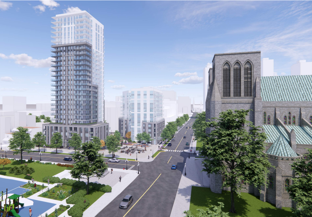
The City of Victoria has finally received a development proposal for the Downtown YMCA property at 851 Broughton Street. Once again, it is a fairly large project with two buildings, one at 26 storeys and one at 11 storeys. Overall, the buildings are pretty stock residential tower, though for whatever reason, I find the 11 storey one more pleasing than the taller one. Still, as longtime readers will know, I am not too concerned with building height, as we generally only interact with a building at the ground level. That said, I do believe that when a developer proposes a tall, high density building, they should be giving us a good overall design in exchange. I also think that the design of the public realm at the bottom of the building should be excellent in exchange for the opportunity to build big. I hope that we will see the actual look of the buildings get refined as we move through the approval process. As for the landscaping and public space design, I think in some ways it is brilliant, and in others, perhaps only slightly better than the grounds at Regents Park, a couple of blocks away and built almost 30 years ago. I thought I would take the opportunity to provide my opinion of just the ground floor plan for 851 Broughton and how I think it could be made more interesting, engaging and show how it could actually create one of the the most dynamic public places in Victoria.
What is Being Proposed?
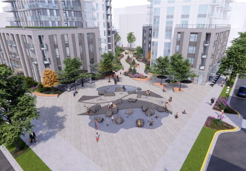
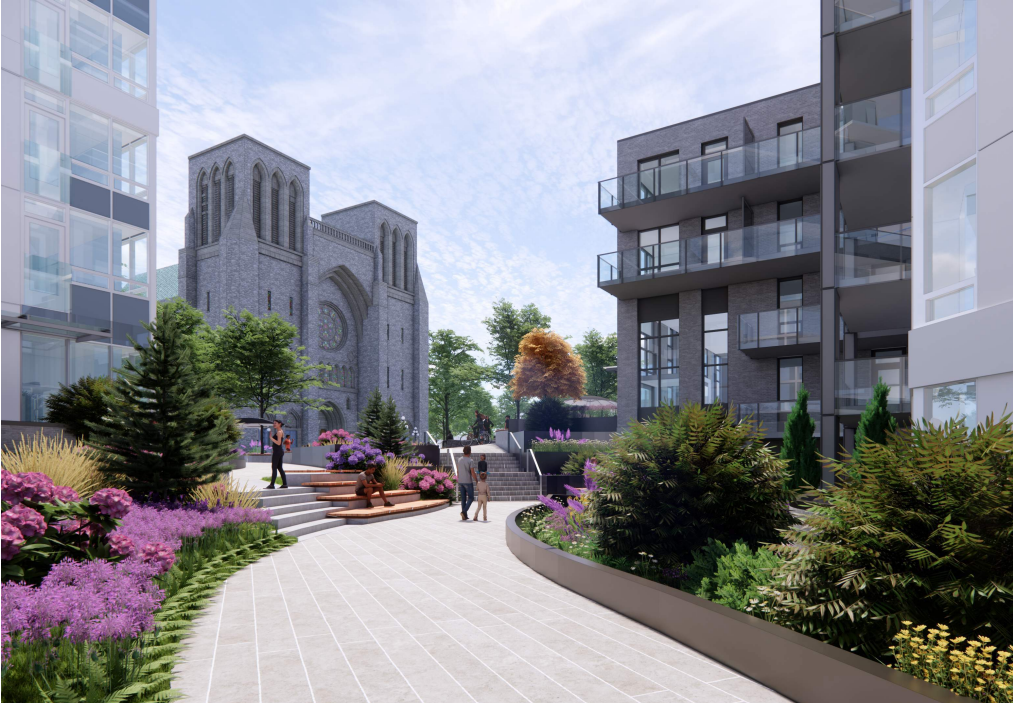
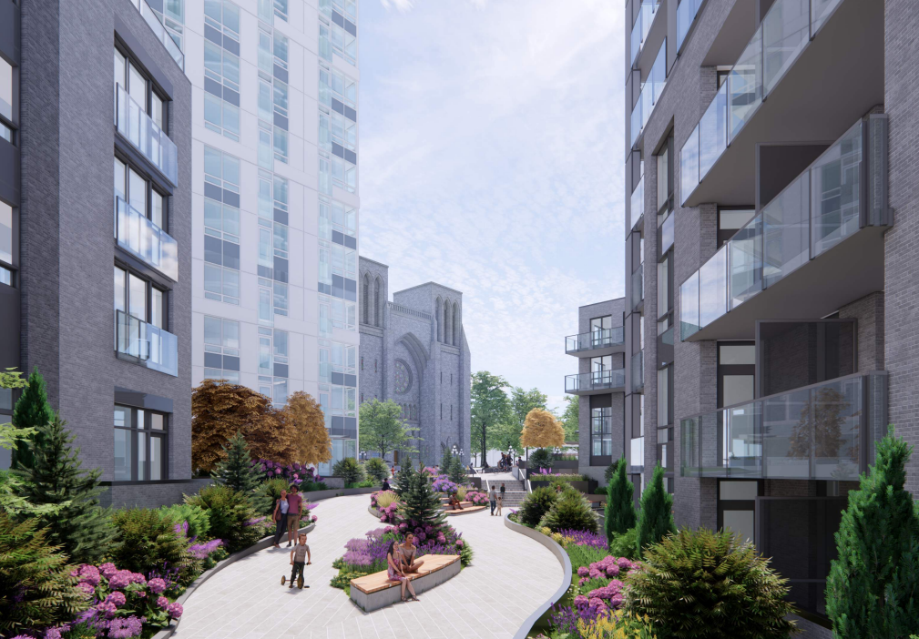
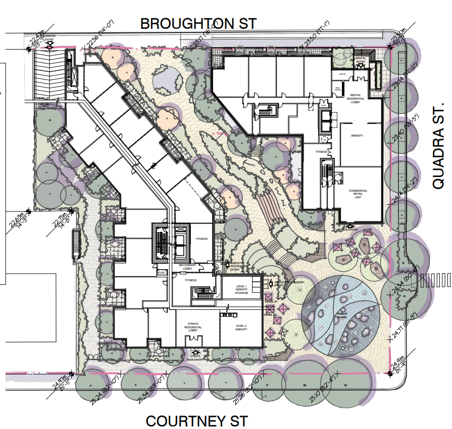
The YMCA decided a few years ago to sell their property, with the idea of finding a new place for their facility elsewhere in downtown. While there have been some discussions on projects where it might be included, no concrete plans have come forward on of where they might end up. The current property is bounded to the north by Broughton Street, to the east by Quadra Street and to the south by Courtney Street. The west border of the property has one developed property along Courtney and another proposed building (though much smaller in scale) along Broughton. The proposal has two buildings, bisected by a public pathway moving from northwest to southeast towards the Cathedral. The building at the northeast is 11 storeys and the one at the southeast is 26 storeys. As you move through the public space which is lined with plantings and townhome entrances, you climb a small rise and have the cathedral across the street and at the corner of the project, a large public space with a water feature meant to be played in. There is only one commercial unit and it is located just to the north of the public space. If you want to see want the entire project looks like, you can check it out on the Victoria Development Tracker (You can open the PDF plans at the bottom).
I love the layout of this proposal, especially with the mid-block walkway on an angle. This will be a natural walking route between Fairfield and Downtown. I expect that it will actually get far more traffic than anyone would imagine due to the angle and the location across from the green spaces of the very popular Courthouse Playground and the beautiful Pioneer Square Park, which has the Rockland Avenue Greenway along it. I also really like that as you enter the walkway from the other end, you will be greeted by a picture-framed view of the cathedral towers, I expect that it will be truly dramatic. As far as the placement of a corner square, based on some of my previous writings on this blog, you might think I would disapprove, but I actually think that this is a special case where more is better. With the square here and hopefully some work by the city to maybe create a new pedestrian scramble and some textured concrete that visually identifies a connection with the multiple greenspaces in the direct vicinity, it actually could become almost a seamless public park with some roads that happen to run through it. Maybe reduce the size of the car lanes to expand the sense of cohesive public space. I also think with the way that the public space is oriented in this proposal, it could potentially create some of the best commercial spaces in the city, if the proponents take advantage of what they have created.
Where the Problems Are
There are two main objections I have with the public space here. First, it is not clear to me that the proponent understands what a truly great space they are on the verge of creating here and second, a lot of it is a little dull. Like I said, the walkway here is perfectly aligned to be truly a pedestrian highway between two of the biggest destinations in the city, Cook Street Village and Downtown. If this existed now and you were to walk to Cook Street Village, you would choose this route. In the summer I would expect there to be dozens of people an hour, maybe hundreds on a sunny weekend walking this path. On top of potentially creating a great walking route, the public square that is proposed here is again in a truly unique and special spot in the city. With nothing ever being built to the south of this lot, this square is going to get sun on every sunny day throughout the year, even when the sun is low on the winter horizon. While I get the pull of putting in a splash park to attract the interest of certain councillors, the playground across the street is awesome already, so I am not positive creating a further destination here for children is the right move, especially when, as I said, this is such a perfectly situated plaza. As you can see in the drawings submitted to the City by the developer, the walkway is lined by planter after planter, which perhaps is visually appealing on a very basic level, it is not interesting. As I said earlier, it reminds me of a slightly fancier version of the public walkway through the Regent Park development (yes the public can walk through there). A more modern comparison might be to the walkway through the Bellewood Park development on Fort Street near the art gallery. As I have said before, context is important and a more suburban, shrub lined walkway makes sense in the residential area of Rockland, but here on the edge of downtown, it feels out of place.
What would I change?
Looking at the two areas where I think the current plan could be improved, taking advantage of the walkway, and making the public space at the southeast a true people place, I really think that this development has the potential to create one of the best and most used public areas in the city. The ingredients are all here. I have taken the landscape plan that the developer included in their package and that I included above in the images from the dev tracker, and made my own edits to it. Not huge ones by any means, like I said, the layout of the walkway and the public space is perfect, it just needs a little tweaking. First, I would add a couple more commercial units so that you could have two in the public space and a third along the walkway. I think all of them should have extensive patios, as I really think there is an opportunity to create a real food destination here. Again, as I said before, there are few places in the city that are going to have the guarantee of sunlight for most of the day, all year long (on sunny days of course). Plus, Victoria is really lacking in the patio space and those few that do exist which are oriented in a similar way, are already popular, including the very nearby Discovery Coffee. With the tables spilling farther out into the public space, I think the fountain should be reduced in size. As I said, there is a good children’s park across the street. A fountain that you can sit on and wait for your friend who is walking up from Cook Street Village would be ideal.
In the walkway I think that the changes are pretty simple apart from the additional commercial unit and patio. As the design is now, it is simply too full of planter boxes. They need to be just generally toned down to give the space a more modern and urban feel. I love the inclusion of the steps / seats in the middle and I would extend them to create a larger sitting area. With the removal of some of the planters, I would add some good public art that can again define the space and make it a more interesting place to visit.
These, of course, are just my own musings, I would love to hear what you would do with the space to make it more interesting than what has been proposed. Let me know in the comments!


